When you need to create an application with a specific look and feel across multiple platforms and devices, PhoneGap can be the perfect tool. But before you just wrap your application up and ship it, you'll want to use Responsive Design techniques to ensure all users get an appropriate experience regardless of their device. For instance, you don't want the 320 x 480 version of your app appearing scrunched to that size in the middle of an iPad, or even worse, in the upper left corner. Conversely, you don't want your beautiful iPad app scrolling horizontally and vertically on every smaller device. So you'll want to use Responsive Design to tailor your HTML5 application to as many devices as possible, and then use PhoneGap to progressively enhance the experience when viewed natively on mobile devices as well.
Flexible grids and media queries are important part of implementing Responsive Design in your website/application. Once the application is looking and functioning the way we want it on our desired device(s), we can use PhoneGap to access additional functionality if we are being viewed on a mobile device, and PhoneGap Build to automatically generate the native binaries for many smartphone devices using our single HTML5 codebase.
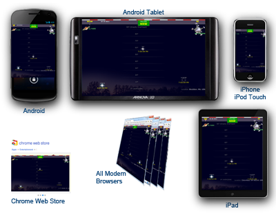
We're going to target Android and iPhone devices, including tablets, as well as most current web browsers, and the Chrome Web Store for our HTML application.
 Our sample app (links to all versions below) is going to call the Google Geocode API as well as the Heavens Above API to display viewing information for the next pass of the International Space Station based on the desired position. For progressive enhancement, our app will allow mobile device users to merely use their device coordinates, and allow HTML5-enabled users to have access to their history of locations using HTML5 LocalStorage.
PhoneGap Build then compiles the latest version of the application checked into the Git repository, but most intrepid web developers can access all the necessary source code using any web browser.
The Sample Application:
(All versions compiled using identical codebase)
(all browsers and devices)


